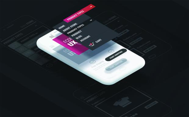
Beautifully designed user experiences are, unfortunately, not always good user experiences. As digital analytics firm Air360 Founder Florent Defontis told Karen Webster in a recent conversation, the trouble is that what a user experience (UX) designer likes is often very pretty and elegant, but that doesn’t necessarily mean an easy experience for the user. In fact, he’s seen cases where good design has actually decreased the effectiveness of the user experience.
“My favorite case is one where the design was so well-made that the search bar couldn’t be found,” recalled Defontis, whose firm was recently acquired by digital-commerce solutions provider Scalefast. “It was a very small icon that blended so well with the background that no one could notice it. When we looked at the user session, people were really searching for that search feature on the website. It was the first thing on the homepage, but it was so well-integrated that it mostly did a great job of convincing people it wasn’t there.”
Confused consumers, he said, don’t convert — they move on. And, according to the data they were looking at, those consumers were moving on to sites that, objectively speaking, had clashing, “straight from the ’90s design” when it came to that search bar. Counterintuitive as it may seem, ugly works — probably, Defontis said, because it was simply impossible for the customer to ignore. And while he has many other similar examples, they all prove the same point: What a UX designer thinks is good design in terms of artistic elegance and what a user thinks is actually a good experience often aren’t the same. It amazes Defontis just how many UX design teams are creating user experience without ever looking at the data.
A good user experience is one that is customized and personalized to what the user actually wants, Defontis noted. Aesthetics doesn’t tend to matter nearly as much as efficiency. The consumer must be able to attain their actual goal on the site as quickly and easily as possible. Building that experience is reliant on having the right data — and knowing how to apply it appropriately, he said.
“There are trends, and it’s mostly about starting with something pixel-perfect and very beautiful,” Defontis said. “There is this misconception, I think, that you can have a great UI [user interface] and a great UX by designers’ standards, but among those who are winning the game today, every single decision is backed by tons of data.”
Knowing What You Don’t Know
When people think of firms looking at their analytics data, Defontis said, most of their minds immediately flip to Google Analytics, and for good reason. With nearly two decades in the game, Google is the oldest player pushing site data as a tool for merchants looking to optimize their choices. But it has its limitations, as it was mostly invented to collect data for Google and offer up some macro key performance indicators (KPIs), noted Defontis, “not to tell you about what your users are actually doing on your website.”
Over the last two decades, as the landscape has shifted to include mobile web use and apps, Google has upgraded its product, he said. The latest version, Google Analytics Version 4, which rolled out about a week ago, is a much more powerful tool that allows site owners to track specific elements of how consumers are interacting with their sites to get a more granular data snapshot. The problem, Defontis told Webster, is that it remains up to a firm’s engineers or developers to explicitly specify the data it wants to track.
“At base, that involves trying to guess what’s going to matter in the future. That’s almost impossible; we’re usually wrong about what’s going to materialize,” Defontis said.
And once the data is gone, it’s gone. Air360, he said, is simple: It tracks everything.
“It’s going to record that data anonymously, discovering what’s important in your app even if you didn’t think of it beforehand,” Defontis explained.
It’s an enriching offering — but also a challenge, given the volumes of data in play when tracking everything. Defontis knows full well that only about 10 percent of that data will be actionably useful to the firm. The major design challenge was finding a way to streamline and upgrade the data capture process so it can grab all of the information without creating terabytes of useless data as a byproduct. That was by far the most challenging and time-consuming element of the construction process for Air360, said Defontis.
Developing Data-Driven Design
There is no single snapshot of what a world of data-driven UX would look like, Defontis noted, because data, when properly leveraged, will serve to deliver a truly personalized user experience — without feeling invasive. Air360 avoids unnecessary maneuvers like running checks against third-party data streams.
As an example, a consumer who shows up to an eCommerce site to purchase an Xbox game probably should see content curated to Xbox, as opposed to seeing a lot of PlayStation games that won’t meet their needs, said Defontis. And a consumer who shows up in an app and immediately heads to women’s clothing should have appropriately curated apparel. Neither is foolproof — in both cases, someone could be buying a gift for someone else — but as time passes and additional purchase data rolls in, the merchant can do a better job of meeting their customers’ needs across the board, simply by understanding what they are actually doing on the site.
“Often, if you can change even the very small details, that makes the user experience feel just a bit more tailored to their needs,” Defontis said.

We’re always on the lookout for opportunities to partner with innovators and disruptors.
Learn More