Did you see Truist Bank’s logo reveal?
The folks at Interbrand, the mega branding agency endured withering criticism when “Truist” was announced in June 2019 as the name of the soon-to-be-merged SunTrust Bank and BB&T. Some people have said it makes them sound drunk when they say the word. There was even speculation that the two banks might pull the name and try again.
Truist stuck to their guns, however, and the merger, and name, was approved by shareholders and regulators, becoming final in December 2019.
The banks rolled out the name without a logo or even a finished website. Now the other shoe has dropped. In January 2020, Truist released the logo and launched an informational website. Still, it will be 18-24 months before customers of SunTrust and BB&T can do business as Truist customers. That’s the length of time the bank needs for systems integration and for instituting changes — including a new mobile app — that are required for the Truist to live up to the promise of the merger.
![]()
Controversy over the name continues. And the logo announcement, not surprisingly, stirred things up again. Though there were fewer reactions than earlier, some reactions to the logo were still pretty blunt.
One anonymous comment sums up the conflicted opinions on this massive rebranding effort: “The name is ridiculous, and I was prepared to hate the logo. In spite of myself, I like it. It’s simple but recognizable. It looks good in application.”
Why Did Truist Rebrand?
The new Truist logo is the largest rebrand in the financial services industry in quite some time, involving a completely new, made-up name. Earlier examples include Renasant, Comerica and Synovus among regional banks. But Truist ranks as the sixth-largest U.S. bank and its branding exercise drew a big, bright spotlight. With experts predicting a coming wave of mergers among mid-sized players, the challenge the Truist partners went through will be repeated as institutions attempt to find names that capture the essentials of banking while reaching beyond traditional themes.
Back in June, Gina Bleedorn, Chief Experience Officer at Adrenaline the brand strategy and branding agency, predicted that the name “Truist” would have many people poking fun at it, in part because of confusion with the actual word “truest.” But she also believed then that the negative views would die down within a year of the name launch, leaving BB&T and SunTrust owning a word nobody else has.
“They went for a made up word as opposed to using a real word like Apple,” Bleedorn tells The Financial Brand. An actual word is an easier marketing sell up front, she says, but over time fanciful names, like Google and Exxon, mean something. Another complication for Truist: a trademark lawsuit over the name by Truliant FCU remains outstanding.
“We think of names as empty vessels that fill with meaning over time.”
— Chris Campbell, Interbrand
Bleedorn thinks Truist’s corporate objective clearly was to balance both sides of the merger in the name. “Truist” suggests trust, which is in both prior institution’s names. “Politically, they checked that box with the name,” she says, and politics definitely came into play with the logo as well, she believes.
Interbrand’s Executive Creative Director, Chris Campbell, says the initial pushback on the name was not a surprise considering that the two prior brands were well-loved by employees and customers and that the name was a coined word. “We think of names as empty vessels that fill with meaning over time,” he tells The Financial Brand. The initial reaction will change once people begin to understand and interact with the brand itself over the next two years.
Interbrand worked with the banks, developing brand strategy, the name, verbal and visual identity, and now the rollout, according to Campbell. He says over the course of several months customers and staff will begin seeing Truist ads in the market as well as some in-branch representation alongside the existing BB&T and SunTrust branding until “Client Day 1,” when people start transacting as Truist customers.
Two early appearances of the new brand include Super Bowl LIV, where Truist is the official bank of the Miami Super Bowl Host Committee, and in another sports venue, the former SunTrust Park, home of the Atlanta Braves, which was renamed Truist Park.
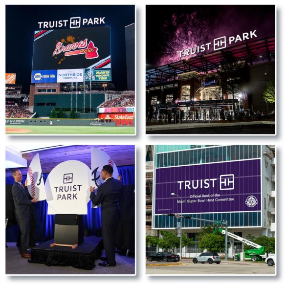
Messing with a stadium name always is dicey and predictably some fans were scathing. “‘Truist Park’ sounds like a nudist resort,” said one wag. But another took a more positive view: Truist’s purple logo color means the SunTrust blue and orange colors — the colors of the hated New York Mets — will be gone from the stadium.
Read More: 5 Ways to Make Sure Your Rebranding Project Doesn’t Fizzle
What the Pros Think of the Truist Logo+Brand Package
Professional marketers have a mixed view of the Truist logo and brand reveal. In a note on his popular branding blog, Armin Vit, the well-known corporate design critic, wrote that while the Truist name “tries a little too hard to sound like something that’s meaningful … as a protectable brand name that ties to the previous names, it’s a pretty commendable achievement.” Vit liked the choice of purple and found the “wordmark is really nice and that detail on the ‘R’ is perfect.” That said, Vit wasn’t buying the bank’s rationalization of the “R” detailing as representing “momentum towards the future.”
“Overall the logo is iconic and modern…but lacking a little bit of soul and personality.”
— Gina Bleedorn, Adrenaline
“Overall the logo is iconic and modern and on trend with a lot of fashion, hospitality and Silicon Valley logos in being streamlined and bold and simple,” states Bleedorn. “But it’s lacking a little bit of soul and lacking a bit of personality.”
“Truist is a case study in political balance of power,” Bleedorn continues. “When I look at the logo I can see how it was sold to the banks. It is a perfect balance of equality between the two entities.” However, that leads to a certain genericism, she adds, as the bank brand tries to be all things to all people.
“Ultimately, the strength of a brand is about the story it tells,” states Josh Streufert, Creative Director and Principal of Strum Agency. “A logo is simply a device that connects the audience to a set of feelings and expectations. I have no doubt this new logo will play its part in helping Truist get there.” Streufert says that logos today require simplicity mixed with a degree of flexibility. “You can see that strategy coming together in the Truist logo and mark.”
Read More:
- Financial Institutions Face Huge Legal Risks When Rebranding
- Google Brand Exec: How to Humanize Digital Experiences in Banking
- How Financial Marketers Should Calculate The Real ROI of Branding
The Icon — Two Ts, Four Ts, Or a Belt Buckle?
A striking feature of the Truist logo is what Interbrand calls the “monogram,” the square graphic device sitting next to the name. Most everyone else The Financial Brand spoke with called it an icon. Whatever you call it, this simple device provokes strong reactions in social media. Among the gems:
“Looks like a trash compactor”
“Is that a capacitor in a circuit diagram?”
“Will make a great belt buckle.”
“Looks like a mashup of Tory Burch and Square”
![]()
Most of those comments come from the Brand New blog site so they’re likely well-informed branding opinions.
Vit notes that the monogram “has an intriguing negative-positive interplay that’s fairly interesting: you can see two small, sans serif, light-weight ‘Ts’ on their side or you can see two large, slab serif, bold-weight ‘Ts’ upright. I like the optical illusion — whether intended or not.” Overall, however, he feels the icon is “too simple for its own good.”
Interbrand’s Chris Campbell says the entire logo was designed for a mobile-first world. Eventually, he says, the “monogram” can serve as a representation of Truist on its own —but not out of the gate.
“We need to build association between the Truist name and the Truist monogram,” Campbell admits. “But in the future, having the monogram on its own being able to represent Truist will be very useful in limited space, such as on smart watches.”
Bleedorn agrees with that approach, citing the Nike swoosh as a classic example. “You can have equity in a mark that’s apart from your name,” she states.
But what exactly is the Truist icon supposed to depict?
Apparently you see what you want to see. Some see two Ts, some four, some don’t see Ts at all, but Hs. Others see door handles.
“Once a brand finds its footing, people stop caring so much about the hidden meaning of two Ts coming together in a square.”
— Josh Streufert, Strum
Campbell says the two Ts on their side stand for “tech” and “touch.” The square itself stands for “trust.”
What about the other two Ts?
“The primary intent are the two Ts on their sides facing each other,” Campbell states. “The negative space created by the square it sits in just so happens to make a T in the negative space as well, which really is just a happy accident from the design.”
Putting all this in perspective, Streufert states, “Those layers of meaning can be helpful for building direction and consensus among stakeholders — but those stories won’t transfer to a general audience, not without heavy investment. And it’s not all that important that they do. Once a brand finds its footing, people stop caring so much about the hidden meaning of two Ts coming together in a square.
Thumbs Mostly Up for the Color Purple
Do a search of bank logos and you’ll find that blue is by far the most common color. Choose blue and you won’t stand out. Purple, on the other hand, is rarely used by banks. Ally Bank is one notable exception.
Bleedorn gives Interbrand kudos for recommending the rich dark purple, which she believes has inherent feminine properties and associations that offset the square and the san serif, all-caps typeface, both of which are more masculine. She also thinks purple depicts loyalty, wisdom and power.
The primary intent of purple, according to Campbell, was to represent the coming together of two organizations — BB&T burgundy and SunTrust blue, which mixed form purple. “From a teammate point of view, it’s a beautiful story of how we’ve left our legacy companies and we’re building something new together.”
“Telling the story of blending a BB&T red with SunTrust blue is pretty compelling,” Streufert agrees. “Purple is strong, high contrast, and reasonably ‘ownable’ in the world of large financial institutions. So it was a good choice.”