
Level Up Your Presentations with Impactful Graphs
This post is the third in the Visual Storytelling series. See the first post, How to Design Eye-Catching Graphics.
Graphs: companies love ‘em, clients are less enthused.
Graphs and charts can be great ways to convey crucial data… when they’re used properly. However, it’s easy for companies to get caught up in the need to over-create, to display as much information as possible in one visual, and that can be confusing to the viewer. You want to present an abundance of meaningful data in a comprehensive and creative way. Your audience wants to look at a graph once and understand what it’s telling them.
So how do you bring these two together? Start by following these tips and best practices to successfully communicate your data as clearly and concisely as possible.
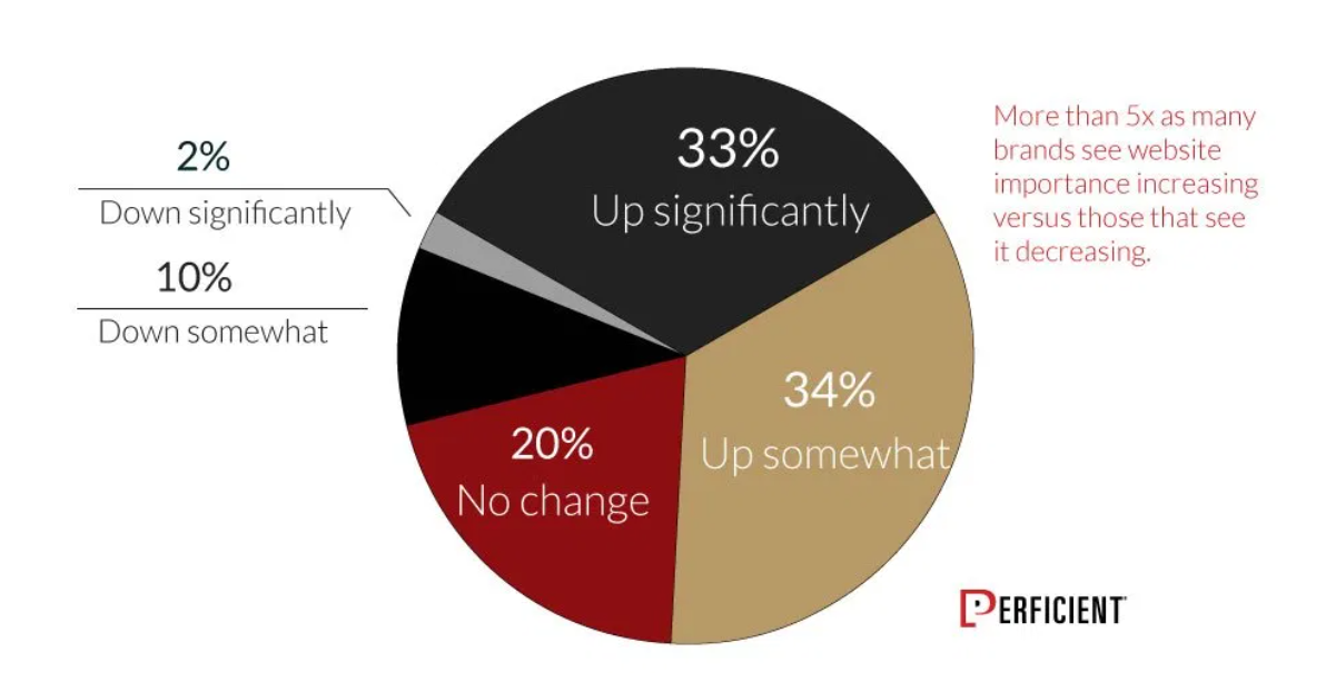
Call Out the Most Important Data
There are three ways to make a piece of data stand out in a graph or chart: form, color, and spatial position. Form differentiates data through structure, it makes the reader think, “one of these things is not like the other.” Distinctive colors highlight data points, allowing them to pop on the page. The use of complementary colors is especially beneficial in graphs, or you might try an all-grey chart with a single pop of red or blue. Finally, spatial position alters a data point’s location within the visual. Because our brains are wired to see the “odd one out”, using position is a great way to capture the viewer’s attention and highlight what is important within a graph or chart.

There are three main ways to differentiate your data – choose the most meaningful design to use in your graph.
Provide Adequate Context

The golden rule of graphs and charts: don’t make the viewer think. If your audience isn’t able to easily comprehend the information in your graph, it’s useless. Make sure to provide the appropriate framework surrounding your graph – like titles, axes, an introductory slide– it will be much easier for the viewer to digest the data if they are given enough information about the context in which it is based. Present the whole picture so they don’t have to put the pieces together themselves.
The addition of context helps the viewer easily understand the meaning behind this chart.
Use Color Wisely
Unlike with graphics and gifs, it is less important to stay within brand guidelines when designing a graph or chart. However, don’t go crazy – use as few colors as possible for the type of graph. For example, a bar graph does not need more than one or two colors, but a pie chart benefits greatly from having a different color for each piece. Pro tip: be cognizant of color-blind viewers when choosing a palette. Stay away from analogous colors – colors next to each other on the color wheel – as the difference between them may not be noticeable to everyone. Refer to this article as a guide for using color within your graphs.

Uniformity is Useful: Adding too many colors distracts the viewer from the real meaning of the data.
Keep It Simple, But Not Overly Simplified
Before you begin creating a graph, ask yourself, “is this data impactful enough to include as a graph in my deliverable?” If not, it’s probably easier to work small amounts of data into bullet points. Make sure the viewer has a takeaway from your graph and can easily understand its importance. Data integrity is crucial in branding your company as a reliable and trustworthy source, so include the most appropriate data, but don’t exclude data just to make the graph look better or support your claim.
Wrapping Up Visual Storytelling…
And with that, our Visual Storytelling series comes to an end. Mastering the use of visual elements is crucial to achieving your marketing goals, so we hope you’ve enjoyed following along with our tips and tricks. Let us know in the comments if you’d like to see more!
READY TO GROW YOUR MICROSOFT CAREER?
At Perficient, we continually look for ways to champion and challenge our talented workforce with exciting projects for high-profile clients, encourage personal and professional growth through training and mentoring, and celebrate our people-oriented culture and the innovative ways they serve Perficient and the community.
Learn more about what it’s like to work at Perficient at our Careers page.
Go inside Life at Perficient and connect with us on LinkedIn, Twitter, and Instagram.