
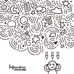
We are in 2020 and are suffering from information overload for a while now.
One solution for this is using an eye more to visualize information. So, we can see the patterns and connection that matters, or we can design that information to tell a story.
Now so, how to be a Good Storyteller?
So, don’t know have to be an old man with a deep voice near the fireplace to be a great storyteller.

The Future of Big Data
With some guidance, you can craft a data platform that is right for your organization’s needs and gets the most return from your data capital.

Few characteristics of effective storytelling understand your audience, engaging them, and avoiding unimportant tangents.
These characteristics also work with data visualization. A person visualizing data is more of a storyteller using his technical skills to narrate a story about data using a different visualization tool. So the characteristics that work for storytelling fits Data visualization too. Let’s take a deeper look into this.
Understand your audience
Like in Storytelling, in Data visualization too, understanding your audience, or we can say end-user is significant. Who are your audience/end users? Top-level Manager, Sales rep., etc. Knowing your audience helps to design your dashboards more effectively, and you can have a higher impact.
Engage your audience
When you are telling a story, it is important to keep your audience engaged. This can be accomplished by connecting with your audience and capturing their attention. In Data visualization, you can achieve this by giving your end-users insights on attractive graphs and visualization. The intention should be to provide trends and patterns from data in easily understandable visualization.
Avoid unimportant Tangents
While telling a story, there is always a possibility of going astray from the main plot. Similarly, it is very important to understand what is relevant and important data with respect to your business in Data visualization. And leaving out the additional unwanted information makes your Dashboard efficient and cleaner.

Understanding the above points, we can conclude that an Analyst working on visualization is similar to a Storyteller. The Dashboard is your canvas. We can use this canvas to create a masterpiece of your own with data flowing from a different source. By merging and blending data on our canvas, you can create beautiful Dashboards. That doesn’t only look good but also provide valuable insight into the business of your client.