In Cognos Analytics, the visualizations possible through Charts and graphs are quite intuitive. It offers various insights into the data that you have. Through this blog, a select category of Bar-chart and the construction behind it is highlighted.
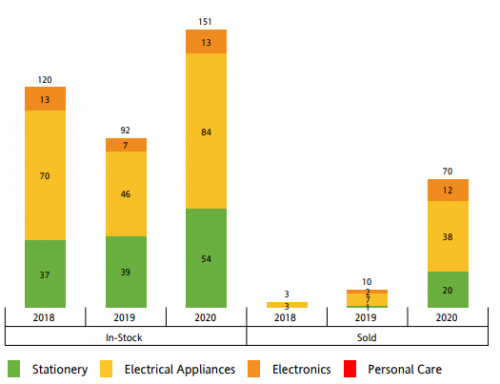
Typically, Bar-charts, as the name suggests, plots Rectangular bars on the Y-axis of varying height for each of the X-axis items. For this example, we consider Store selling Products in various categories. There is a finite quantity of product in-stock as well. The problem-statement is to compare the In-stock quantity against Sold quantities of products for the past 3 years (based on product categories).
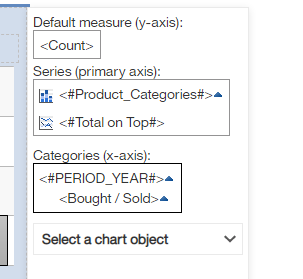
Creating a bar-chart for 2 dimensions is straight-forward. But in this case, there are 3 dimensions to the data ( Bought/In-stock, Year, Quantities). In such a case, we could construct a Combination chart with the nested-x-axis, as shown below.
The above chart creates a tabular structure on the X-axis. Wherein In-stock and Sold quantities first appear for 2018, and then the same pattern repeats for the next two years.
Query design is the most crucial part of the visualization. The query should be constructed as given below.

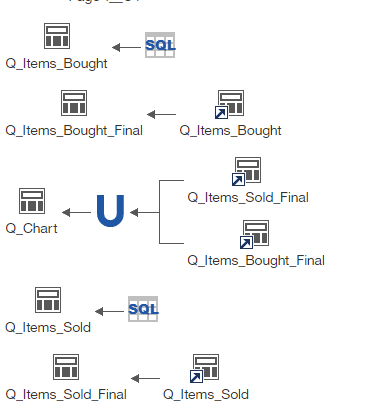
2 Queries (Items Bought and Items sold) should first separately classify the In-stock and sold data. The two questions should have the same 4 fields — ID, Product Category, Year and Bought/Sold, but first, one should filter only for in-stock numbers and the second for sold numbers. The newly-created field here – Bought/Sold will be a static identifier as shown below to classify records.
Next, we should aggregate the number in separate final queries (Items_sold_final and Items_bought_final). The chart query would finally Union these two queries whereby the names would be distinguished based on sold/in-stock as per static identifier.
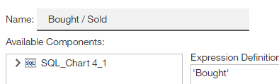
The static Bought/Sold and Year data items should both appear as below. Stacked on top of the other in X-Axis.
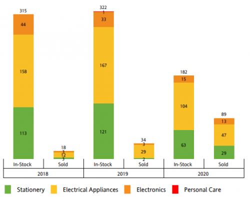
It is also possible to group In-stock and Sold quantities bars as shown below, by simply switching the order of X-axis nesting.
To summarize, Nested category x-axis combination charts in Cognos Analytics provides additional power to existing 2-D visualizations.